Saturday, 12 December 2015

Shoot 5 - Eyebrows - Work Diary and Technique

Evaluation
When studying the beauty topic, I have noticed all magazines which publish studio images of celebrities manipulate their appearance in photoshop. Therefore, to keep my work similar and try and recreate images in the beauty scene, I have also decided to teach myself how to airbrush and edit Beauty images on Photoshop. As we can see from the image below, I have edited Vandana to conform to these expectations. This included me firstly applying the RGB and selecting a colour filter of 'Yellow'. By doing this I was able to see the skins surface much easier as a lot of colour was drawn out. I then inverted this so that I would be able to paint over the bits I want to filter out. This was known as the Flaws process. Following this, I smoothed out the skin using a filter technique which takes away certain flaws - which do not conform to the beauty industry. I found this an extremely hard photograph to edit, as I feel like the positioning of the model as well as the lighting and her skin tone - was something new to me. Although, it has enabled me to learn how to airbrush successfully - to conform my work to that of the beauty industry. Below, you can see the technique I went through summed in a few images and also the final image which has been airbrushed.

Technique


Edited Image:

Progression

In my next shoot, I aim to experiment more with the makeup choice and use a softer background. I feel like using a white background, will give a stronger contrast and brighten the models face. I will then experiment with a bolder colour, perhaps on the lips to enhance femininity. I also want to incorporate the colour gels, to give different tones on the face and highlight different parts of her face. I will also try and use different angles and compose the model in different ways.

Friday, 11 December 2015

Shoot 4 - Connie - Work Diary and Technique


Evaluation
During this shoot in which I did with Connie, my aim was to take images to appear like those you would expect to see in advertising and on magazines. I feel like this shoot was my best one by far, and I got several good images. However, one image stood out to me due to the positioning of the model and the framing in which I shot. The head tilt is a posture commonly used by models so that the audience is able to see some of the neck aswell as some of the hair. When I was taking the images, many of the gems fell down and I had to replace these in Photoshop. Below is a step by step technique of how I managed to get from the first image to the last one. I love this image, however it did have many flaws which luckily I managed to adjust through Photoshop. I taught myself how to change the colouration of the skin, reshaping certain aspects whilst airbrushing and removing flaws. The video I used was extremely helpful as it enabled me to gain more experience and will also help me apply this knowledge to shoots further on in my project. I then applied makeup on photoshop, as I decided to take images which were completely makeup free so I was able to do my own makeup in photoshop. 
Technique 


Shoot 4 - Connie - Animation


via GIPHY

Shoot 4 - Straight Images


Saturday, 5 December 2015

Shoot 3 - Work Diary

Evaluation

During this shoot, I continued with my idea of using a male model and placing makeup on him in order to achieve a slightly feminine image. When applying the makeup, I felt as though it was too strong early on and didn't fit into my topic of beauty as it subverted it too much. Therefore, I simply decided to leave the stubble and make a masculine male with a feminine idea. I set up the studio, by placing two redhead lights with honeycomb diffusers over the top. This allowed me to direct the light so that it wasn't so strong as only appeared on a certain part of his face. I also used a beauty dish which was placed up high pointing down, creating soft and subtle shadows but still giving the face a nice glow to conform to the publishings in magazines. This worked, however I felt that all of my images were coming out very similar and I didn't get much variety in my shoot.

Following this, I decided to place two different colours of glitter on the face. I was hoping to get two clean stripes, however using face glue gave a sticky glow and the glitter was going clumpy on it. The model had to hold there face up causing fairly awkward pictures. I changed the lighting to suit this and I feel like my images came out well in contrast to the previous shoot. I used two different coloured blue gels, which I enhanced in photoshop. In Photoshop, I went onto the Hue/Saturation tool and changed the strong blue colours. By adding a slight white tint, the image appeared brighter and the glitter stood out more. Again I sharpened the eyes and the facial features so that they stood out. I tried images with certain lights turned on and I feel I really experimented my use of lighting in this shoot as I had enough time in the studio to do so.


The image above is my favourite from the shoot due to the colours it emits. I changed the colour on Photoshop so that it went from a strong blue, to a more artistic colour. With the soft green and pink tinge on the face, the image appears darker and also allows facial features to appear more masculine. I also like the contrasting colours on the background, and a soft gradient is present with a dark header and a slightly brighter middle of the frame. Below is an image from the shoot which is unedited, it appears messy and the colours are very dull baring in mind I used two strong colour gels. I feel as though the biggest contribution to this shoot was the use of Photoshop in cleaning up the glitter and enhancing the colour.


Progression
In my next shoot I wish too use diamond gems with more relation to the beauty industry. I will aim to get a range of different close up and portraiture images within this. I want my work to draw similarities to that of Rankins, with high key lighting and a smooth complexion. I will aim to learn how to airbrush on Photoshop properly without losing pores and making sure that my image is cleaner and more crisp. I feel like the work of Rankin will influence me a lot, and I have strong ideas to take smooth and cleaner images.

Tuesday, 1 December 2015

Shoot 2 - Work Diary

Evaluation

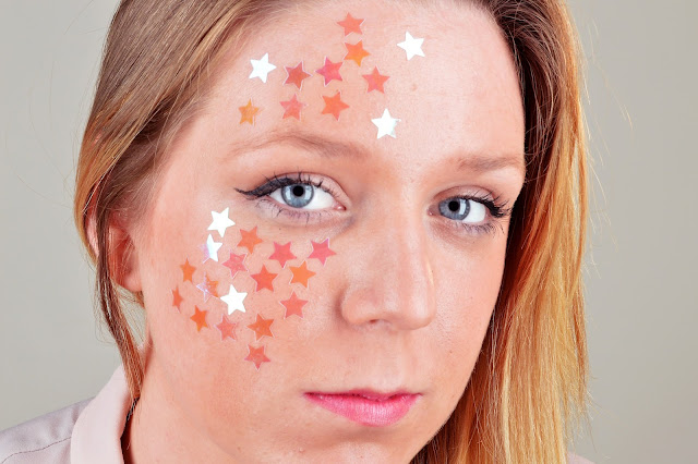
During this shoot, I decided to place different gems on the face of my model. My lighting setup consisted of a backlight, lighting up the backdrop, and it also consisted of two lights at the front of the camera. This allowed me to light up the face to get a soft yet high key lighting effect on the model. When shooting, I looked at a range of different methods in which I could focus purely on the face, without blurring out the stars in which I placed around the eyes and on the forehead. I ensured that the makeup used was fairly subtle, so that it didn't stand out and overpower the see through stars. I changed the background several times in my shoot, which can be seen through the contact sheets. Editing the images was one of the hardest parts of the shoot, as I had a problem sharpening the stars and the eyes without making them appear to full on and stand out as fake. On photoshop, I changed the levels and curves, however I realised that the colour of the stars also went a pale orange colour when they were usually see through. Ideally, I would have used metallic stars in my shoot as I feel like they would be more successful in refracting the light and making the image more effective, similarly to that of Rankin's diamond shoot.

My favourite image from this shoot was the following. One of the reasons I like this image so much is due to the composition in which the model fills the majority of the frame, but also because it features some of the blue colour in the backdrop. I understand that the colour blue is not often used, however I feel as though it was a nice contrast to what I had already seen, and when I used a white background it appeared quite unclean and messy. I like the way in which the eyes are the main focal point and the model is looking directly into the camera. In photoshop, I didn't airbrush the skin as it appeared unnatural this close up, although I did enhance the colours of the eyes and changed the colour of the stars. I also took the colour picker tool and matched one of the stars to the colour of the lips so that there was a correlation between the makeup used and the accessories chosen.


One of my regrets when doing this shoot was not using the technique of 'Colour Gels' from my shoot 1 in this. By doing so I feel as though I would've been able to create images with more colour and texture, while illuminating the face in a softer way. I will also aim to take pictures in my next shoot from further away as this time they were all very close up.

Progression

In my next shoot, I want to do the same type of shoot by placing accessories on models, but instead I want to follow the work of Elisabeth Hoff who I studied in my photographer research and place it on males. By doing so I hope to subvert the stereotypes and make a feminine aspect of beauty on a masculine figure. I will do this through different coloured backdrops and emphasising the face with the gel lighting.


Thursday, 12 November 2015

Shoot 1 - Colour Gels - Animation


Shoot 1 - Colour Gels - Work Diary

Evaluation 

When we went into the studio on Thursday, we explored creating portraits but with the use of colour. The way we did this was by using colour gels to explore a range of tones and colours and the effect it can have on different portrait images. In the studio, I was first to take images and a lot of my images are a journey through the different about the different lights in which I can use. At first, we used a soft box, two back lights and a light above us. The two back lights had honeycomb grids which diffused the lights and centred them more directly on the model. When I first took images, the pictures came out to be clear and crisp with soft light, however it was quite dull and just a usual portrait image. 


One of the differences between these shoots and others in which I have done in the previous unit is that I explored a range of coloured gels, and used a different style of taking images. In this shoot, we used different light diffusers and we worked in a new studio. This made my shoot more interesting, and gave me more inspiration to use different technical items in which I haven't used in previous units. It also widened my technical skills. When getting to this point, I trialled the different amounts of light I could use in my shoot and the impact it had. To show this in a visual way, I decided to create an animation which showed the impact different lights had on these images. 

Progression

This shoot allowed me to explore a range of technical ideas, however due to it being the first shoot of its kind in which I have done. I want to explore a range of different shoots and enhance my different lighting techniques. I also want to conform it more to my beauty topic, and I want to look at developing my style and creativity. For example, I want to use a range of different props such as glitter. My next shoot is going to feature different accessories which I will stick to the face to highlight different areas like I have studied in my photography research.